2026 Top Furniture Design Tips for Retail Spaces

Time:2026-09-24 Author:Madeline
0%

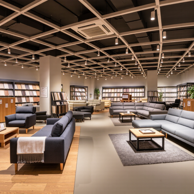
A retail space is more than a place to display products. It is where shoppers judge comfort, quality, and whether a brand feels worth their time. The 2026 Furniture Design Tips For Retail Spaces in this guide focus on practical choices: clear circulation, flexible displays, durable finishes, and seating that invites customers to pause. Small details matter. A narrow aisle beside a bulky sofa can make a beautiful showroom feel difficult to navigate.

Physical stores also influence activity beyond the sales floor. ICSC’s 2018 Halo Effect study found that opening a store was associated with an average 37% increase in online sales within its market area. That finding is older, and it does not prove that furniture alone caused the increase. Still, it supports a useful point: the in-store experience can shape how customers engage with a retailer across channels. Thoughtful layouts, tactile materials, and well-lit product groupings can help shoppers understand scale and function before they buy.

Good design is not decoration alone. It must work on a busy Saturday, not just in a quiet concept image. Leave room for strollers, delivery conversations, and customers comparing fabric swatches. Some decisions will miss the mark. Review traffic patterns and ask staff what repeatedly causes friction; then adjust displays rather than defending them. The following tips offer a grounded starting point for building retail spaces that feel inviting, usable, and easy to adapt.
2026 Top Furniture Design Tips for Retail Spaces

Define Retail Zones Around the ADA’s 36-Inch Minimum Accessible Route

A clear route is the backbone of a comfortable retail floor. The ADA’s 36-inch minimum accessible route gives designers a practical starting point for arranging furniture and merchandise. Measure the usable space between obstacles, not just the gap shown on a floor plan. Chair legs, display bases, and open cabinet doors can quietly narrow a passage.

Start by grouping the store into distinct zones: browsing, fitting, checkout, and waiting. Keep a continuous route at least 36 inches wide between them, and avoid placing promotional baskets where shoppers need to turn. A tape measure helps. So does a slow walk-through using a cart or mobility device, if available. Check entrances, corners, and queue areas, where furniture often shifts during busy hours. A route that looks generous on paper may feel tight in real use. I’ve seen carefully planned layouts lose clearance after one small display move. That is easy to miss.

Treat the 36-inch figure as a minimum, not a target for every location. Wider paths can make passing and turning easier, especially near busy displays. ADA requirements include details beyond route width, and applicable building codes may add requirements. Confirm the layout with a qualified accessibility professional before installation. Then recheck it after merchandising changes. Retail floors are never quite finished.

Set Fixture Heights Within the ADA’s 15–48-Inch Reach Range

Retail fixtures should make everyday items easy to see and reach. Use the ADA’s 15–48-inch reach range as a practical planning guide for accessible controls and commonly handled products. It is not a blanket rule for every shelf or display. Applicable requirements can depend on the fixture, reach direction, and surrounding space.

Measure from the finished floor, not from a raised platform or thick display base. Keep frequently selected items, such as mugs or packaged goods, within the range where possible. A low shelf can still be hard to use if a deep counter blocks a customer’s approach. Check reach depth and clear floor space, too. Small details matter.

Test a sample fixture with people who have different heights and mobility needs. Put a real product on the shelf, then check whether it can be seen, reached, and removed without awkward twisting. Not every display will work perfectly; that is worth admitting early. Adjust shelf spacing before ordering a full run. For project-specific decisions, verify current accessibility requirements with a qualified professional.

Plan Seating and Checkout Areas to Preserve Accessible Clearances

In retail spaces, seating should invite customers without narrowing the route through the store. Place chairs beside a wall or display edge, leaving a clear path for wheelchairs, strollers, and customers carrying bags. Measure the space after furniture is installed, not just on a floor plan. A chair pulled out can change everything. Keep tables stable and avoid low, hard-to-see bases near walking routes. I have found that a layout that looks open on paper can feel cramped once people gather around a display. That is worth checking in person.

Checkout areas need the same attention. Leave room for a customer to approach, turn, and stand comfortably without blocking the main aisle. Position queue barriers so they guide people without creating a narrow pinch point beside the counter. Keep baskets, promotional stands, and loose chairs out of accessible routes. Small details matter. A single sign base can become an obstacle. Test the arrangement during a busy period, when queues and shopping bags change how the space works. It may take a few adjustments; even a careful plan can miss real-world traffic. Confirm clearances against applicable local accessibility requirements before finalizing the layout.

Select Retail Lighting by IES Guidance and Color-Rendering Needs

Retail lighting should help shoppers judge furniture accurately while making the space comfortable to browse. Use IES guidance as a starting point for recommended light levels, distribution, and visual tasks, then verify conditions on the sales floor. A reading chair needs enough light to reveal fabric texture; a polished tabletop needs controlled highlights, not distracting glare. Measure at furniture height as well as along walkways. A bright ceiling can still leave a sofa looking dim.

Color rendering matters. High color-rendering light can make wood tones, upholstery, and finishes appear more faithful, but compare samples under the actual fixtures before choosing. Check saturated colors and neutral fabrics, too. Warm light may flatter oak but shift gray textiles toward beige. Mixed light sources can create uneven color across a display. That is easy to miss on a plan.

Tips: Choose fixtures with consistent color quality across the room, and check their stated color-rendering data. Aim light at furniture surfaces, not directly into shoppers’ eyes. Test a small display at different times of day; daylight may change the result. Keep dimming controls simple, though staff may not adjust them consistently. I would review the setup after opening week, because real shoppers reveal shadows and glare that mockups rarely catch.

Choose Modular Fixtures to Adapt Layouts to Changing Store Demands

2026 Top Furniture Design Tips for Retail Spaces

Choose modular fixtures that can shift with your store’s changing needs. The U.S. Census Bureau reported that e-commerce accounted for 16.1% of total U.S. retail sales in the fourth quarter of 2024. Physical stores still matter, but their role keeps evolving. A display that works during a quiet weekday may block traffic during a weekend launch. Freestanding shelves, nesting tables, and movable display cubes let staff open sightlines or create small product zones without rebuilding the floor. Small changes can help.

Tips: Choose fixtures with lockable casters and adjustable shelves. Keep frequently changed displays near power outlets and storage. Test a new layout with removable floor markers before moving heavy units. Measure aisle widths after every change; a flexible plan can still create bottlenecks. I’ve seen stores overlook this simple check.

Modularity also makes seasonal updates less wasteful. A low table can become a gift display, then return to its original role near the entrance. Select durable finishes and standard components that staff can replace or rearrange easily. Record which layouts support smooth browsing and replenishment. Not every experiment will work, and that’s useful feedback. Keep notes on what felt cramped, what sold quickly, and where shoppers paused.

FAQS

What is the ADA’s minimum accessible route width for a retail floor?

The route must be at least 36 inches wide. Measure the usable gap between obstacles, not just the space on a floor plan.

Which store areas should connect through a clear route?

Connect browsing, fitting, checkout, and waiting areas. Keep promotional baskets out of turning spaces.

What can unexpectedly narrow an aisle?

Chair legs, display bases, and open cabinet doors can reduce clearance. Even one moved display may make a route feel tight.

Is 36 inches always enough for comfortable movement?

It is a minimum, not an ideal target for every spot. Wider paths can make passing and turning easier.

How can staff check a proposed layout?

Use a tape measure and walk the route slowly. A cart or mobility device can reveal tight corners and awkward turns.

Why use modular retail fixtures?

Movable shelves, nesting tables, and display cubes help staff adjust zones without rebuilding the floor. Small changes can help.

What features make fixtures easier to rearrange?

Lockable casters and adjustable shelves support quick updates. Standard components are also easier to replace.

How should a store test a new fixture arrangement?

Mark the layout on the floor before moving heavy units. Then measure aisle widths again, because flexible fixtures can still cause bottlenecks.

How can seasonal displays reuse the same fixtures?

A low table might hold gifts for a season, then return near the entrance. Record which arrangements feel cramped or support smooth browsing.

What should stores review after merchandising changes?

Recheck route widths, entrances, corners, and queue areas. A qualified accessibility professional can help confirm the layout; floor plans alone may miss details.

Conclusion

Furniture Design Tips For Retail Spaces in 2026 focus on creating shopping environments that are accessible, comfortable, and easy to adapt. Start by organizing merchandise into clear zones while preserving an accessible route at least 36 inches wide. Set frequently used fixtures within the 15-to-48-inch reach range, and arrange seating and checkout areas so customers can move and use them without blocked clearances.

Lighting should support visibility and accurate color perception, with fixture choices guided by appropriate IES recommendations and the needs of the merchandise. Modular furniture can make future layout changes simpler as products, customer flow, and store priorities evolve. Together, these practical design choices help create a welcoming retail space that balances usability, flexibility, and visual appeal.

Madeline

Madeline

Madeline is a dedicated marketing professional with a wealth of expertise in our company's core offerings. With a keen understanding of the industry, she brings a unique perspective to her role, consistently delivering high-quality content that highlights the superior aspects of our products. As......