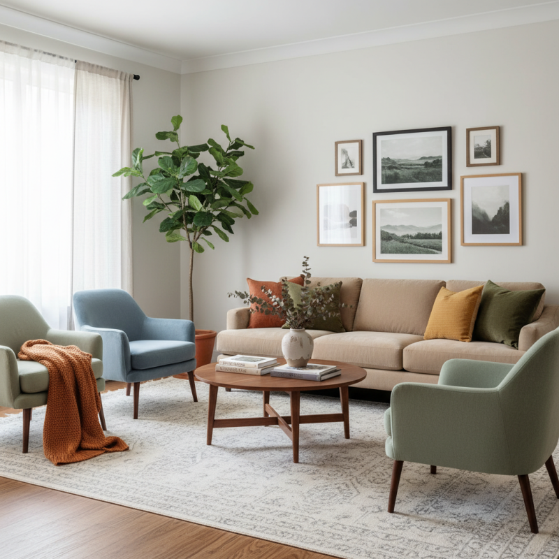
Choosing the right colors for your furniture can transform your home. This decision impacts mood, style, and overall aesthetics. Understanding furniture color matching tips is essential for creating a cohesive look in any room. Colors can enhance the space or clash, leaving you dissatisfied.
Consider how different colors interact with your existing décor. Warm tones can invite comfort, while cool colors might introduce calm. Mixing and matching can be tricky. Sometimes that bright chair looks stunning but feels out of place next to your sofa. Reflect on these choices critically.
Remember that not every color combination will work perfectly. It’s okay if your selection takes time. Experimenting will lead to better results in the end. Trust your instincts, but also seek out expert advice when needed. Embrace the process of finding that ideal balance in your home décor.
Choosing a color palette for your home decor requires a touch of creativity and an understanding of color theory. Colors evoke emotions and set the tone for any space. Warm colors like reds and yellows create energy and excitement, while cool colors such as blues and greens add calm and serenity. Mixing these shades can lead to a dynamic yet harmonious environment.
When selecting furniture colors, consider the room's purpose. For a cozy living room, earthy tones can foster relaxation. For an energizing workspace, brighter hues may enhance focus. Pay attention to lighting, too. Natural light can change how colors appear throughout the day. Sometimes the same color may feel different in various lights.
Tips: Test paint or fabric swatches in your space. Observe how they interact with your existing decor. Don't be afraid to experiment, paint swatches on walls, or use large fabric samples. Strive for balance; too many colors can overwhelm. Reflect on how each color makes you feel. Your home should resonate with your personal style and comfort.
Colors play a crucial role in shaping the mood of a room. Research indicates that colors can influence our feelings, productivity, and even our overall well-being. For instance, a study by the Journal of Experimental Psychology found that blue tones can create a sense of calm, making them ideal for bedrooms. This is essential for restful sleep, as a serene atmosphere can lead to better mental health and relaxation.
On the other hand, warm colors like red and orange can generate energy. These hues are perfect for social spaces, as they encourage interaction and conversation. However, overusing these colors can lead to feelings of agitation. A professional interior designer often recommends balancing warm colors with neutrals to avoid overwhelming the senses. Additionally, incorporating natural elements, like wood and plants, can soften the intensity of vibrant hues.
It's also important to reflect on personal preferences when choosing colors. What works for one family might not suit another. Consider how different colors resonate with your daily activities. For example, a bright yellow could energize a kitchen but may feel too stimulating in a home office. Recognizing these subtleties can enhance your home’s atmosphere, making it a true reflection of your lifestyle.
When it comes to choosing furniture colors, understanding complementary and analogous colors can make a huge difference.
Complementary colors are those that sit opposite each other on the color wheel. For example, pairing a blue sofa with orange accents can create a vibrant contrast.
This approach adds energy to your space. However, be cautious. Overusing bright contrasts can make a room feel chaotic.
Analogous colors, on the other hand, are next to each other on the color wheel. A combination of greens and blues can create a serene atmosphere.
This strategy promotes harmony in your decor. It's important to choose shades that are different enough to stand out but similar enough to create a cohesive look.
Here are a few tips:
Choosing the right colors for your furniture can drastically alter the ambiance of your home. It’s essential to visualize how these colors work together. This is where samples and swatches come into play. Testing color combinations on walls or furniture allows you to see how they react under different lighting. Natural light changes throughout the day, affecting how colors look.
Consider purchasing small paint samples or fabric swatches. This hands-on approach provides you with a better sense of how colors interact. Place swatches next to each other to visualize the overall look. Sometimes, colors you thought would complement each other may clash unexpectedly. Don’t shy away from testing bold combinations; they often produce a striking effect.
A practical tip is to create a mood board. Gather images, colors, and materials that inspire you. This visual representation can aid in decision-making. Reflect on how you feel about the colors together. If something feels off, trust your instincts and adjust. It’s all part of the process. Embracing imperfections in the selection can lead to unique and personal decor.
Creating a cohesive look in home decor involves thoughtful furniture color matching. One must consider how colors interact with each other and represent various styles. According to a 2022 industry report by the American Society of Interior Designers, 42% of respondents emphasized color harmony as vital to overall satisfaction with their living spaces.
Selecting a primary color for larger furniture pieces is crucial. Neutral colors like beige or gray can provide a solid foundation. Then, introduce colors through smaller elements, such as cushions or artwork. This layered approach adds depth while maintaining balance. However, it can be challenging to ensure that accents complement rather than clash with the main furniture. Research shows that 68% of homeowners sometimes regret their color choices. This highlights the need to experiment thoughtfully and frequently reassess decisions.
Another aspect to consider is texture. A variety of textures can convey a cohesive theme even when colors differ slightly. Mixing wood finishes with soft fabrics may create warmth and comfort. Yet, this approach demands careful attention. Too much variation can lead to a disjointed look, causing visual chaos in the space. Balancing both color and texture requires a reflective process, as achieving harmony is often more intricate than anticipated.
| Color Scheme | Furniture Type | Accent Colors | Suggested Combinations |
|---|---|---|---|
| Neutral | Sofa | Soft White, Beige | Wood Accents, Green Plants |
| Bold | Accent Chair | Navy Blue, Mustard Yellow | Gray Walls, Metallic Decor |
| Earthy | Dining Table | Terracotta, Olive Green | Natural Fibers, Wooden Accessories |
| Pastel | Bed Frame | Pale Pink, Mint Green | White Linens, Floral Patterns |
| Monochromatic | Bookshelf | Shades of Gray | Black and White Art, Textured Fabrics |
: Colors evoke emotions. Warm colors create energy, while cool colors provide calmness.
Earthy tones work well. They foster relaxation and comfort in a cozy setting.
Yes, lighting changes color perception. Natural light alters how colors look throughout the day.
Use paint or fabric swatches in your space. Observe their interaction with existing decor.
Complementary colors are opposite each other on the color wheel. They create vibrant contrast.
Analogous colors are next to each other on the color wheel. They create a serene atmosphere.
Begin with a dominant color. Build your palette with accent shades that enhance it.
Absolutely! Experimentation is key. Take your time to find what feels right for your space.
Think about room purpose and your personal comfort. Reflect on how colors make you feel.
When it comes to enhancing your home decor, following effective Furniture Color Matching Tips can make a significant difference. Begin by choosing a color palette based on the fundamentals of color theory, which helps you understand how different colors interact with one another. Consider the mood you'd like to create in each room—colors can greatly influence ambiance, so select hues that complement the desired atmosphere.
Utilizing complementary and analogous colors is essential for furniture selection. Complementary colors create contrast, while analogous colors harmonize the space. Don't forget to test color combinations with samples and swatches, as this practice ensures that the final look meets your vision. Lastly, focus on creating cohesion by matching your furniture with other decor elements, making your space feel unified and thoughtfully designed.
GHENT Furniture